Wednesday, 7 December 2011

Window Paper..


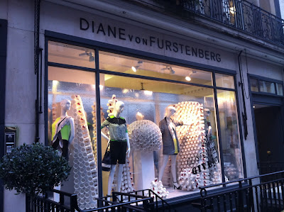
Two very different paper concepts from Diane von Furstenberg and Topshop. I have to admit, even though I like the branded cups, I am not a fan of DVF's window..too cluttered and crowded for the small window space!

Topshop have hit a great nostalgic nerve with their instore displays..the clever use and positioning of the small paper games throws you and your pig-tailed hair straight back into junior school!

Monday, 21 November 2011

Moschino


Moschino have shown how easy it can be to fill a large space with just a few accessories. The over-sized bold props stand out without taking attention away from the actual products on sale..a little bit of genius!

Matthew Williamson's Winter Wonderland!


Matthew Williamson's display in Mayfair practically takes over the store its so big! The extra depth makes it eye-catching and almost theatre-like!

Thursday, 3 November 2011

Topshop Seeing double..

Brilliant concept from Topshop for AW 11 windows..the use of one very large slanted mirror.

Very slightly blurred images of mannequins in the Topshop window on Oxford Street catch the attention of passers by. Taking an impulsive second look and they soon realise that they are in fact looking at a reflection of the mannequins, all of which are lying beneath the mirror. Such a simple idea..yet so very effective!

Tuesday, 6 September 2011

Accidental work of art from IKEA!

Had to add this photo..ok, so its not the most thought over vm display but I love it! Its clearly just a couple of boxes full to the ceiling with hangers but its eye-catching and fun..top marks for IKEA’s accidental work of art!

Tuesday, 16 August 2011

Selfridges - bursting with colour!

Absolutely love Selfridges windows at the moment! Oxford street is bursting with colour with these eye-catching displays. Its never easy to include accessories in windows, especially on their own..which is why im a particular fan of the accessories windows that Selfridges have created. The simple use of bold colour and surreal dream-like themes must have been any visual merchandiser’s dream! The furry monster on wave flooring is definitely a favourite!


Monday, 27 June 2011

Clare McCarthy (BA Hons International Fashion Business)

Thought I would throw in a copy of my promotional cards and information page from my degree show exhibition booklet! 3 years of hard work..time to celebrate First Class Honours!!


Rewind a few months..

Haven’t been on here for a while due to serious amounts of stress during my final year of University! All nighters + copious amounts of redbull = one very crazy final year student. I made it though and am now on the hunt for my dream job. My dissertation was focused on Britishness and even though it was a couple of months ago, I HAVE to mention something about the Royal Wedding. The window displays in and around London were incredible, a real celebration of Britishness..the windows have never been so patriotic!! Here are a few of my favourites..